Design Thinking Artwork Critique

Unaltered & Featured image taken from http://tip.touch.com.lb/design-thinking-important/
The following is an analysis of the P.A.R.C (Proximity, Alignment, Repetition, and Color) principles of the design used for the Touch Innovation Program website. The content in which this image was paired discussed design thinking and its importance. I really enjoy this design and have dissected it to my knowledge of design principles so far.
Overall Thoughts:
This expressive and active design tells a message while being visually appealing. It is symmetrical and somewhat predictable in that the separation is right down the middle. The main attribute that I notice from this design is its contrast, both in color, content, and imagery. Repetition is present but not what one would initially notice at first glance and not a hallmark for this piece. The alignment and proximity of the piece are done well but could have been slightly different to produce a more breathable piece. The color is what I like most about the design and why I wanted to analyze it further. The use of so many colors and the level of their vibrancy illustrate the message of the creative side of the brain.
Color:
Use of colors as vibrant as those shown can often be challenging but the artist seems aware especially in the parts of the design that incorporate yellow. Because it is much more passive hue there is a lot of it right next to the contrasting blue, purple, and red. As I notice the areas where yellow is next to white the color appears dim. The yellow areas next to these colors seem more potent or rich. The contour lines also help in the brain section to bring those colors saturation to feel full. Without these supporting combinations I lose attention to those parts of the design, it is not where my eyes naturally flow. The orange-yellow of the notes and titles on the science side are lighter in visual weight but spreading the notes helps to not feel off balance. The absence of color on the gray side is also a wise way to make the colors feel that much more important.
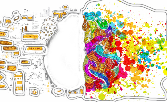
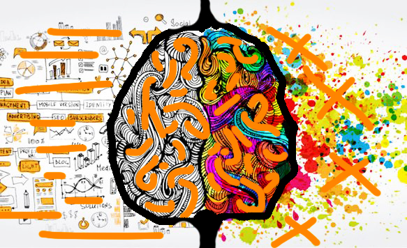
Here is an image in which I have taken out all the black and outlined the main areas of color to help illustrate how the principle of color was used. The combination and placement of these colors next to one another is what allowed there to be as many as there. The amount of each color used helps create a feeling of harmony, avoiding overwhelming the piece with one color or another.
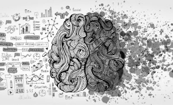
Imagine if there were no color, in this image we see that the design is much flatter and losses its eye catching quality.
Contrast:
The contrast of the black and white design to the bright colors is a nice application that separates the opposing sides of the image. On the right are many splatter marks and they cover one another with little regard for the boarders of the other elements of that side. The left side conversely are ordered pictures of equations, graphs, and other scientific objects.
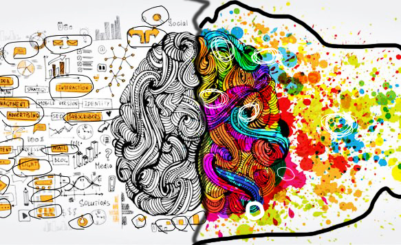
The left side is much less busy and jumbled while the right side looks like a paint ball war. I circled the small areas of contrast as well in black and white. The left side of the image with the notes are a simple means to pull some attention back to this side. The white circles show the use of the complementary colors which are great in bringing contrast. The middle lines here is to show further how the design itself is very contrasting through its elements.
Proximity:
The piece does not have much room to breathe and the proximity could have been emphasized to extenuate the opposites even more had there been some use of negative space. The math and science art are separated and placed in the closer proximity with the black and white side as is the art splatter to the color side. This builds the relationship of the respective background to the paired foreground. The zen-like gray doodle of the brain has clear relationship to its counter part of the colored brain zen brain. Perhaps the purpose of not separating the brain to demonstrate the opposites connection.
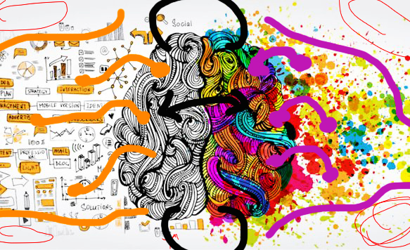
This image shows how the elements correlate in the design. The purple lines show how the creative side of the brain by proximity is linked to the splatter. The black lines show the connection between the two sides. The orange lines show the connection to the gray and black side of the brain to the logical diagrams. The read lines show the limited space and where perhaps more space could have been added.
Alignment:
The use of the canvas shows little principles of alignment. Though the content on the left side is more orderly it is so close together that from a first glance it still appears cluttered. The is a tighter edge on the color side which does pull in the image making it appear more concise to me as a observer. I would likely try to empathize this even further, pulling the splatters tightly to a point and giving the other side more negative space could make the entire concept to appear more structured.
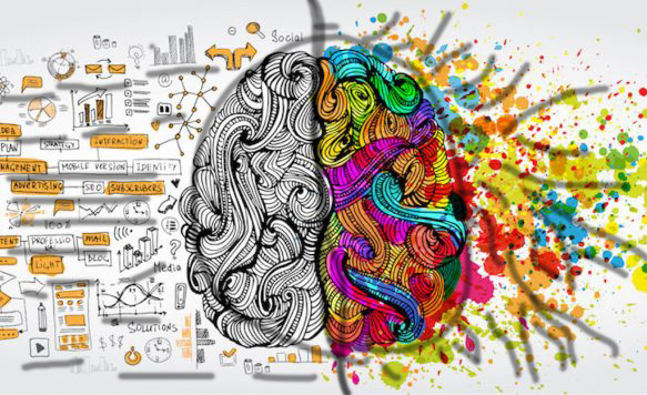
The alignment is formed in a landscape format and the left side is aligned through horizontal orders of short and long lengths. The right side is aligned through very inconsistent elements that all have directional point toward the middle. The brain split in the middle is center in the frame of the image.
Repetition:
The repetition of the piece is seen in the flow of the zen doodle and the content of the opposite elements, clearly keeping a consistent theme for each side. There is good unity in the artwork but the best use of the repetition present in the piece is that there is not too much.
The right side has repetition in that all is organized and colored. The left is repetitious though its alignment and order. The center is shows repition though its flow of swirls and shapes.
Conclusion:
This artwork uses the principles of design well and balanced many opposing elements successfully. The most successful parts were color and contrast. The only lacking element was that the proximity of the elements were too close together as whole. This was great design for the Touch Innovation Program post since design thinking requires both strength of creativity and structure.
Link to site where I found the image:
Follow My Blog
Get new content delivered directly to your inbox.
