Be yourself; Everyone else is already taken.
— Oscar Wilde.
This is the first post on my new blog. I’m just getting this new blog going, so stay tuned for more. Subscribe below to get notified when I post new updates.
Be yourself; Everyone else is already taken.
— Oscar Wilde.
This is the first post on my new blog. I’m just getting this new blog going, so stay tuned for more. Subscribe below to get notified when I post new updates.

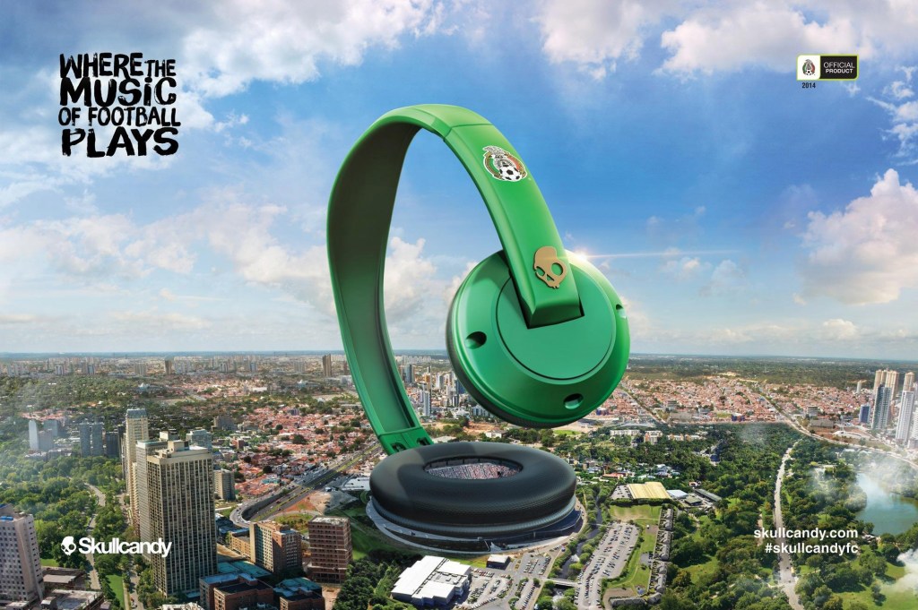
Who doesn’t love music? It is one of the largest parts of my life and when I saw this ad I was perplexed at first glance. I then began to be deeply engaged with by the message as I looked closer. There are many aspects of this ad I really enjoy! Here is a few of my thoughts. This ad is part of a campaign made by the agency network Shango. Credit of team members from the campaign is listed below.
The overall layout for the original ad was a cityscape overlooking a stadium which football/soccer is played. Then a set of headphones was placed to act as to as if one of the headphones is the stadium. Then the message, headphone logo, social media tags, and sport connect wore place in separate corners. There are many good principles of design however the use of contrast is what got my attention. The proximity of the fonts and their separation from the headphones is my only critique of the particular add because it disconnects the image from the message.

When first looking at the ad, it took me moment to realize what was going on because the proportions are so different then what one expects. My mind understood I was looking at a pair of headphones and at first, I thought they were just laid on top of the cityscape background. I looked to see a hand or something linking the trick of perspective showing the headphones seeming so large compared to skyscrapers but when not finding that I looked close to find that the enormous headphones were the soccer stadium. This use of extreme scale, not only creative, but was the only reason I eventually spent another moment to look closer at the image and meaning. It was a great use of the design principle demonstrating that twisting the normal perceptions of life can bring a viewer to pay attention.
The original ad had minimal words but just enough pass along the true message of the advertisement.
“Where the music of football plays” a fun and clever slogan to tie the headphones to the fan-base. The text is in a Sans-serif decorative font. It has a handwritten resemblance where it has certain areas, often where lines meet, that do not fully connect. The rest of the prominent text resemble the Skullcandy logo font text. It is also a san-serif font but it does not have anything uniquely distinguishable.

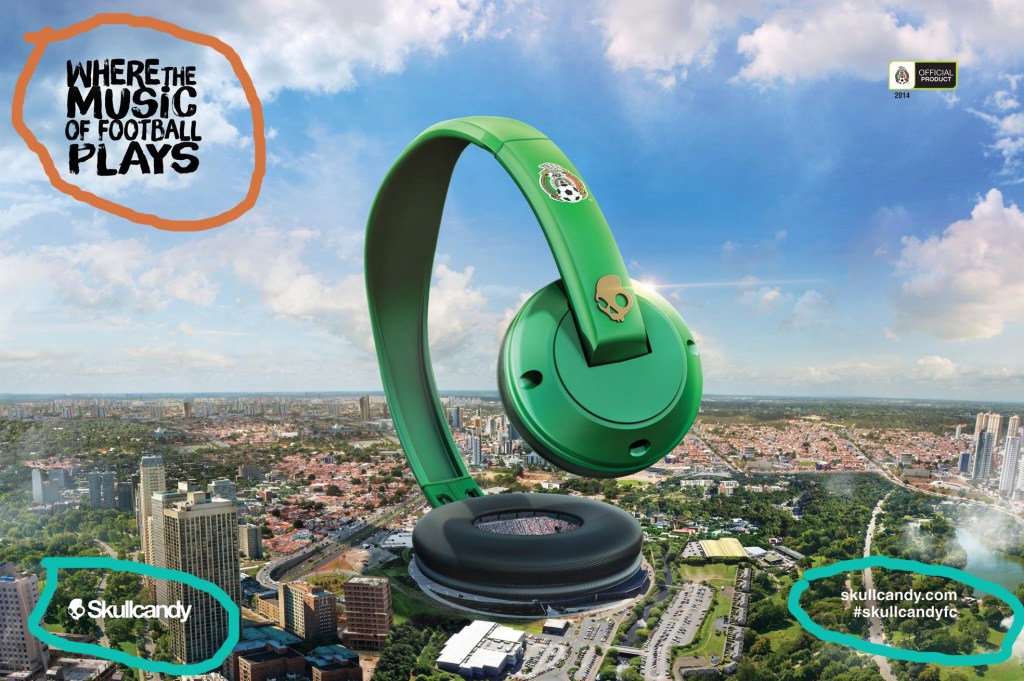
This add uses the one of the primary colors of the soccer team which is green. The trees and green areas tie the neon green into the front of the picture and make it come to focus immediately. I have highlighted to show further that characteristic in green. The middle area of the add is mostly brown, red , or gray. They are very neutral tones that a view has no reason to focus on and often will cause the eye to move. These colors are in the tan-orange areas. The light sky blue behind the neon green is very bright and has high energy. The shadows of the sky is what allows the light blue to work, in some areas of the background there are dark blues that balance those colors to not feel flat. This section is found above the blue line.

While trying my attempt to create a add that could be part of the same campaign, I took slightly different approaches to communicate the same message. I used the city of Los Angeles with a pair of silver and brown headphone to become the Dodgers’ stadium.
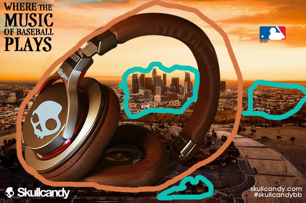
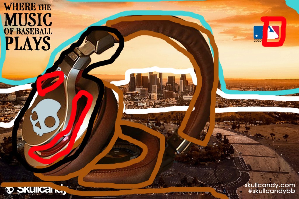
The key principle that I knew was essential to translate from the original add to my mock-up was the proportion difference between the city and the headphones. The size is very similar, but I was able to use an image that produced a less symmetric design and one that was more connected to the main message and the Skullcandy company because it is close in proximity to those elements. The four text elements are still in their respective corners, but the association is immediately made.
This add uses the one of the primary colors of the soccer team which is green. The trees and green areas tie the neon green into the front of the picture and make it come to focus immediately. I have highlighted to show further that characteristic in green. The middle area of the add is mostly brown, red , or gray. They are very neutral tones that a view has no reason to focus on and often will cause the eye to move. These colors are in the tan-orange areas. The light sky blue behind the neon green is very bright and has high energy. The shadows of the sky is what allows the light blue to work, in some areas of the background there are dark blues that balance those colors to not feel flat. This section is found above the blue line.
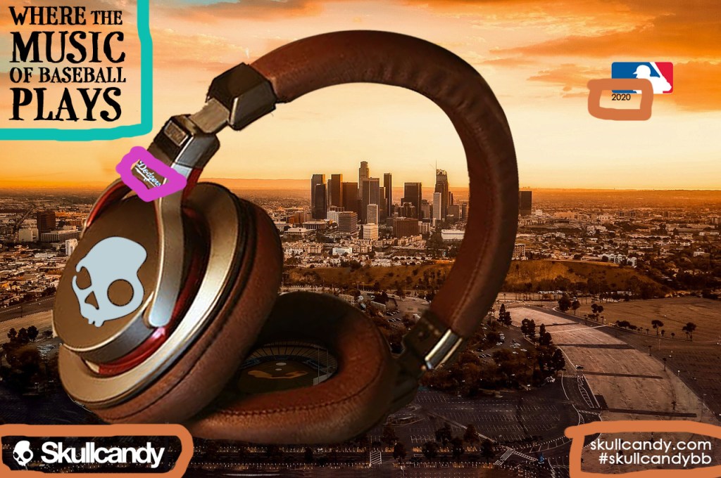
While trying to find fonts to mimic the original I ended up find a Serif font that has the handwritten and decorative feel that the original had, the only characteristic this font does not have is that it is serif. The font family is P22 Stanyan and it is circled in blue. The logo and social media links are the same as the original and are circled in orange.
CreditsAdvertising Agency: Shango, Buenos Aires, Argentina
Creative Directors: Beto Resano, Lucas Bottero
Art Director: Ramiro Fernandez
Copywriter: Juan Malka
Illustrator: Carlos Wyszogrod
Photographers: André Fofano, Cassio Vasconcellos, Leonel Albuquerque, Jobson Galdino
VFX director: Alejandro Agrasar
Executive Production: Fernando Fasano
Account Director: Gonzalo Guardiola
here is a placeholder
This is an example post, originally published as part of Blogging University. Enroll in one of our ten programs, and start your blog right.
You’re going to publish a post today. Don’t worry about how your blog looks. Don’t worry if you haven’t given it a name yet, or you’re feeling overwhelmed. Just click the “New Post” button, and tell us why you’re here.
Why do this?
The post can be short or long, a personal intro to your life or a bloggy mission statement, a manifesto for the future or a simple outline of your the types of things you hope to publish.
To help you get started, here are a few questions:
You’re not locked into any of this; one of the wonderful things about blogs is how they constantly evolve as we learn, grow, and interact with one another — but it’s good to know where and why you started, and articulating your goals may just give you a few other post ideas.
Can’t think how to get started? Just write the first thing that pops into your head. Anne Lamott, author of a book on writing we love, says that you need to give yourself permission to write a “crappy first draft”. Anne makes a great point — just start writing, and worry about editing it later.
When you’re ready to publish, give your post three to five tags that describe your blog’s focus — writing, photography, fiction, parenting, food, cars, movies, sports, whatever. These tags will help others who care about your topics find you in the Reader. Make sure one of the tags is “zerotohero,” so other new bloggers can find you, too.
